Tell a story
Crosby Elements: copy and IA redesign
What is the best way to convey a story through product?
Role: Copywriter, UX researcher
Team of 2 alongside: Kelly Harland, CEO
I listened to: Joni Mitchell (ad nauseam)
I ate: buffalo chicken lettuce wraps
Tools
Shopify, Optimal Workshop, trusty pen + paper
Methods
Data analysis, open card sort, user flow
Move the brand from candle company to perfumery line
Crosby Elements was built to showcase Kelly’s talent as a perfumer and her ability to showcase that skill in a multitude of products for human and home. However, as the popularity of one product grew, the company was pigeonholed as a candle company. Kelly consulted with a project manager to help reframe the company and grow the business and brought me in as a copywriter to retell her story. My goal was to transform the existing copy to something more natural, distinguishing, and that moved the brand identity from candle company to full fragrance line.
After reviewing competitor companies, we realized that it was very important for Crosby to distinguish itself by speaking to Kelly’s connection to the land, as well as the philanthropic nature with which she runs the company.
Tone + Descriptors
I wanted to set a distinct tone of voice and used specific descriptors that could be utilized throughout the site, updated the storytelling, and wrote the copy for a new product line’s pitch to bring travel to the forefront of the business.
My work, along with Kelly’s dedication and our fantastic project manager, resulted in an increase of revenue of all product lines, established Crosby Elements as a perfumer, and successfully integrated the new product line. My copy was written on both the packaging and web product description of the new Residency Collection.
Beautiful, but large photos
Kelly came back to me a few months after the copy work to talk about sales. She realized that people were abandoning their carts on mobile and that sales were just not quite where she wanted them to be. I started with a dive into the analytics provided by Shopify. I learned that the load time, particularly on mobile, was quite slow at times: up to 4 seconds. We moved the images from 300 dpi to 72 and cut load time significantly.
Information Architecture
Next came a restructure of the site architecture
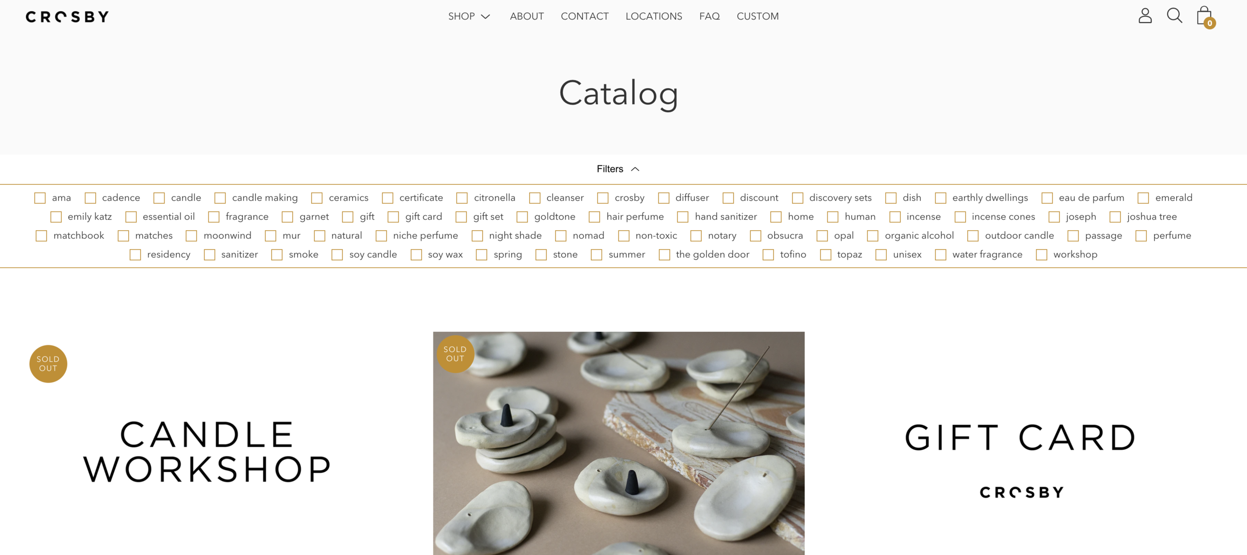
During my initial research, I discovered that Crosby Elements had a TON of options for filters, but only 25 products. To rectify this, I conducted an open card sort. After 20 responses, I was comfortable in my new information architecture layout. I brought this up to Kelly and mentioned that I suspect she was listing her SEO codes in the filter section. This turned out to be true.
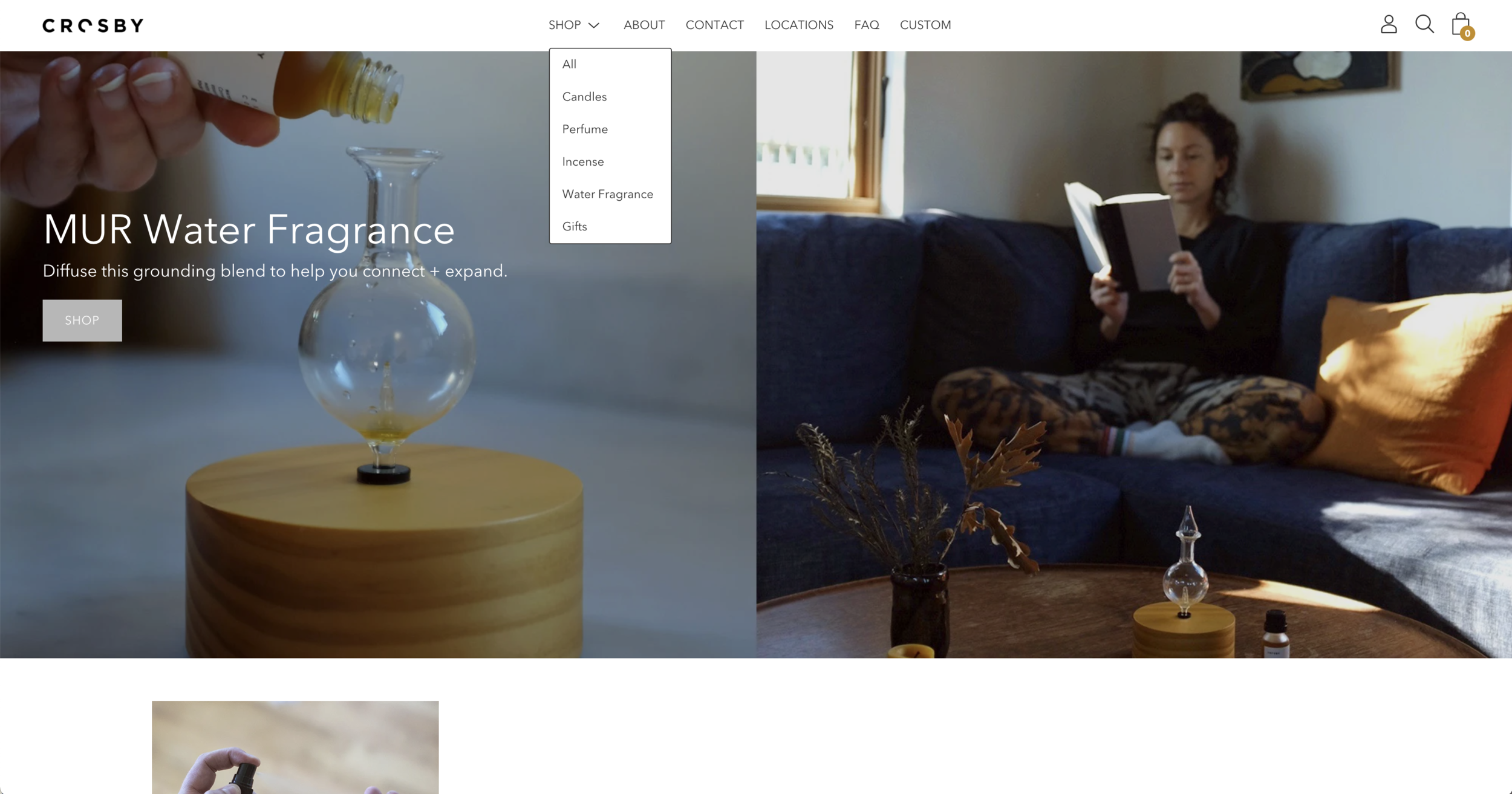
In addition, the site shopping categories were listed as Home and Human. While these are great to use as a tagline for Crosby Elements (for home and human), they don’t work well for searching. Using the results from the card sort, the categories were updated to the image below.
What I learned
A key takeaway, and an important reminder to every small business owner, is that your site architecture is not where you should flex your creativity. People will gather that from the site design, but if they are there to shop, lay it out for them.


